


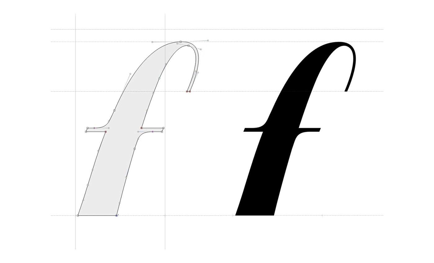
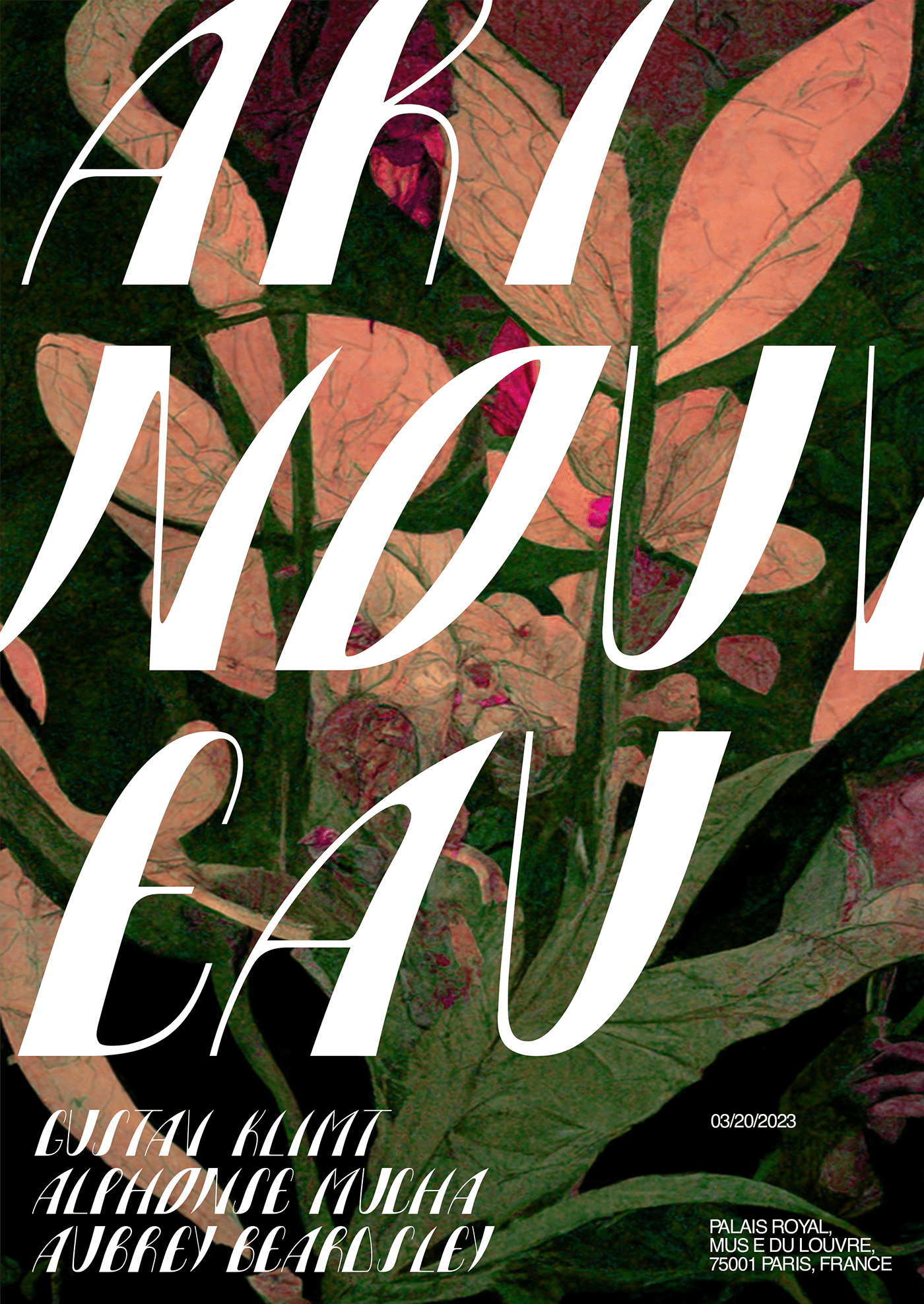
В рамках модульного обучения в НИУ ВШЭ я создала собственный шрифт под названием «GAUDI».
Он вдохновлён работами художников и архитекторов направления модерн. Особенностью шрифта является сочетание толстых и тонких черт, гармонично соединённых, благодаря плавным скруглениям на стыках
As part of the modular training at the HSE University, I created my own font called «GAUDI». It is inspired by the works of Art Nouveau artists and architects. A special feature of the font is the combination of thick and thin features, harmoniously combined with each other, thanks to smooth rounding at the joints


В основе шрифта лежат три разных модуля — для букв с прямым штрихом (A, H, N), для букв, имеющих скругление (B, C, G) и отдельно для букв O, Q. У всех глифов имеется скругление между элементами
The font is based on three different modules — for letters with a straight stroke (A, H, N), for letters with a rounding (B, C, G) and separately for the letters O, Q. All glyphs have a rounding between the elements


Шрифт имеет недостатки и недоступен для скачивания.
Но если проект соберёт много лайков, я доработаю его и выпущу!
UPD: Скинула draft-вариант, можете качать, редактировать или использовать только Uppercase.
The font has flaws and is not available for download.
But if the project gets a lot of likes, I will finalize it and release it!
UPD: I threw off the draft option, you can download, edit or use only Uppercase.


